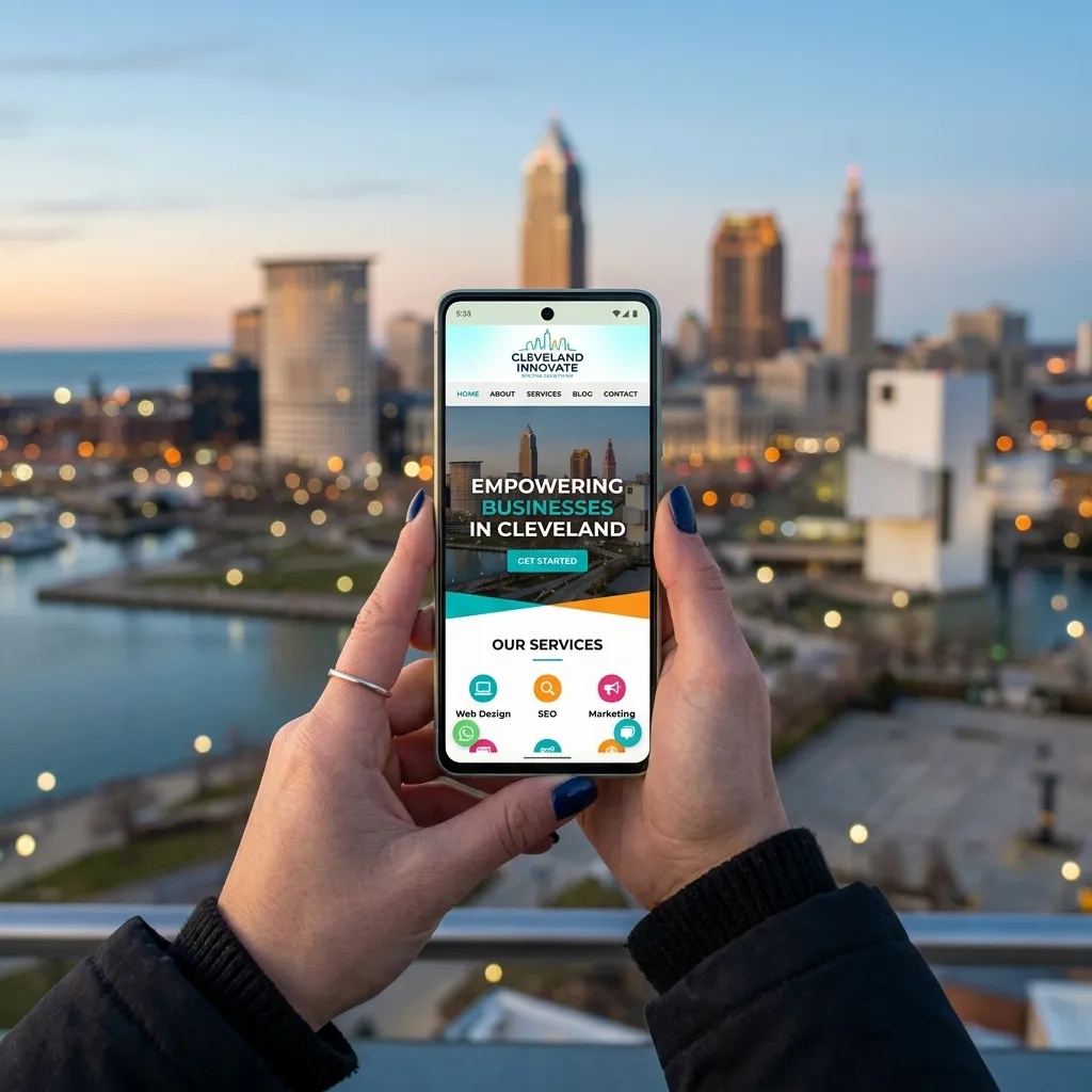
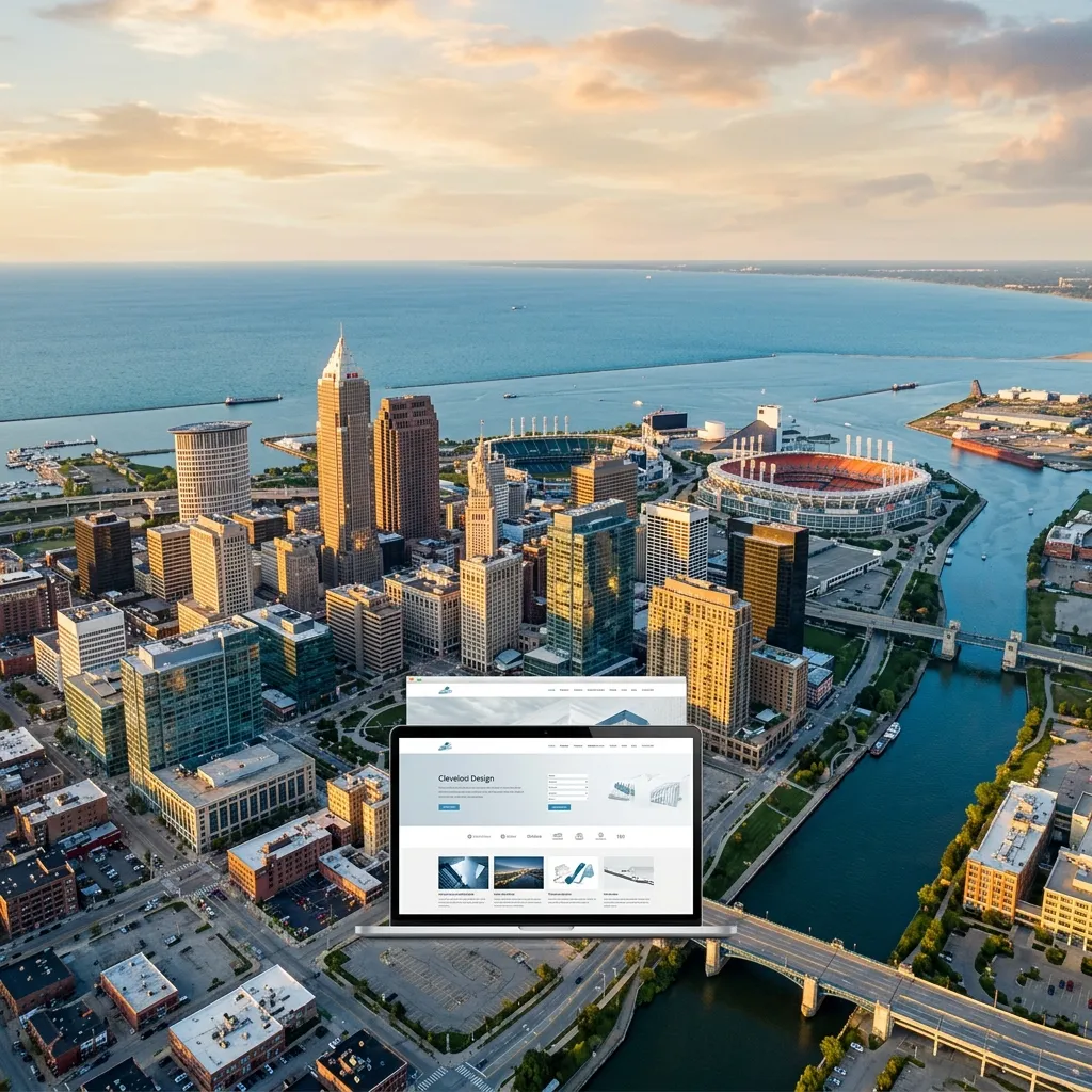
Website design trends evolve constantly, but the best Cleveland businesses aren't chasing every fad — they're adopting the trends that actually improve user experience and drive conversions. Here are the design approaches that are delivering real results for businesses in and around Downtown Cleveland in 2026.
The most effective design trends for Cleveland businesses aren't about looking flashy — they're about improving speed, accessibility, and user engagement. Dark mode, micro-animations, and minimalist layouts all serve a functional purpose alongside their visual appeal.
Dark Mode Design
Dark backgrounds with light text have moved beyond phone settings into mainstream web design. For Cleveland businesses — especially restaurants near East 4th Street, bars in Ohio City, and creative studios in Tremont — dark mode creates a premium, sophisticated feel that immediately sets a brand apart.
Dark mode also reduces eye strain for evening browsers, uses less battery on OLED screens, and makes colorful elements like photos, CTAs, and brand accents pop dramatically against the dark canvas.
Micro-Animations & Scroll Effects
Subtle animations triggered by scrolling or hovering create a sense of depth and interactivity. These aren't the heavy Flash animations of 2005 — they're lightweight CSS and JavaScript effects that make a page feel alive without hurting performance.
Effective micro-animations include:
- Fade-up on scroll: Elements gently appearing as the user scrolls down the page.
- Hover state transitions: Buttons and cards that subtly shift color, shadow, or scale on hover.
- Loading progress indicators: Visual feedback that tells users content is loading.
- Counter animations: Numbers counting up to display statistics or results.
Use animations to guide attention, not distract from it. If an animation doesn't serve the user's journey toward contacting you, booking a service, or learning about your business — remove it. Performance always beats decoration.
Glassmorphism & Frosted Effects
Semi-transparent elements with blurred backgrounds create a modern, layered look. This trend works particularly well for hero sections, navigation bars, and card components. When done right, it adds visual depth without cluttering the layout.
Bold Typography & Custom Fonts
Oversized, bold headlines paired with clean body text create strong visual hierarchy. Businesses near Playhouse Square and University Circle are embracing expressive typography that reflects their brand personality — moving beyond safe defaults like Arial and Times New Roman.
Key typography trends include variable fonts for performance, serif/sans-serif pairings for contrast, and extra-large hero headings that immediately communicate the brand message.
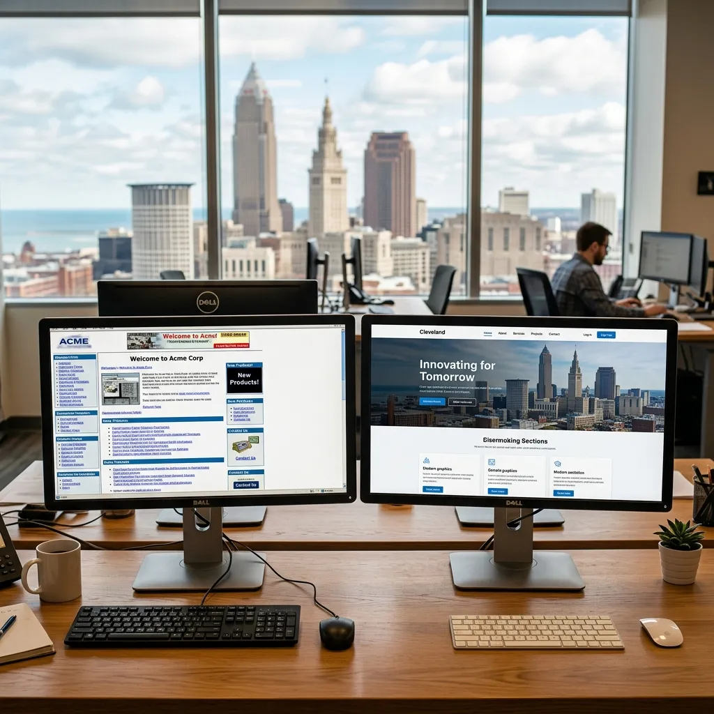
Minimalist, Content-First Layouts
Cluttered websites with sidebars, banners, and pop-ups are being replaced by clean, focused layouts. The trend is toward generous whitespace, single-column content, and clear visual hierarchy that guides the eye from headline to CTA.
For Cleveland service businesses, this means fewer distractions and higher conversion rates. A clean layout with one clear call-to-action per section outperforms a busy page with five competing elements every time.
Accessibility-First Design
Inclusive design isn't just ethical — it's good business and increasingly a legal requirement. Modern Cleveland websites are prioritizing proper color contrast ratios, keyboard navigation, screen reader compatibility, and alt text for all images.
"We redesigned a Downtown Cleveland law firm's website with accessibility as a core requirement. Not only did it meet ADA compliance, but the improved contrast and readability increased their contact form submissions by 28%. Good accessibility is good UX design."